
Rules of Composition
Mother’s Pride
As everyone knows, "Those who can, do; those who can't, teach" - but that doesn't stop me trying to do both!
Whatever kind of photographer you are and whatever kind of pictures you take, you always need to pay attention to composition.
As an introductory guide (or a reminder), here are a few principles of composition to help you take better pictures. Just make sure you break all of them once in a while!
Rule of thirds
The most famous rule in photography is the rule of thirds.
The aim of the game here is to avoid taking pictures that are too symmetrical. For some reason, the human eye doesn't like that, so it's usually best to place the subject off-centre. The rule of thirds is just one way to do that.
Others include the golden ratio or the Fibonacci curve, and you can find them in Lightroom if you really want to (by pressing R and then O to cycle through the options), but the rule of thirds is the best and the simplest.
The idea is that you imagine the viewfinder is divided up into thirds - both horizontally and vertically, like a Noughts and Crosses or Tic-tac-toe grid - and place the subject at the intersection of two of those invisible lines to give it more impact.
The lines also help you to place the horizon (or your subject). If the horizon is in the middle of the frame, it looks a bit static. Instead, try to establish whether most of the interest is in the land or the sky. If you want people to focus on the land, place the horizon on the lower imaginary line; if you want people to focus on the clouds in the sky, place it on the upper one. Just make sure that it's straight!

'The Decisive Moment'
Henri Cartier-Bresson was a French photographer considered a master of candid photography. He pioneered the genre of street photography.
The Decisive Moment was the title of a book he wrote, and his idea was that timing is the secret of a good photograph.
This is obviously more important in certain types of photography (such as wildlife) than others (such as landscape), but it is still a useful guide to taking any kind of action shot.
Framing
Every photograph obviously has a frame, but have you ever tried using a 'frame-within-a-frame'?
Photographic frames come in all shapes and sizes, and so do the ones you find in real life.
It might be the branches of a tree or a doorway or a window - the point is that it adds depth to a picture and focuses the viewer's attention.
Separation
If you have more than one subject in the photo, it generally looks best if they don’t overlap (as shown below). It sounds like a vague generalisation, but it works surprisingly often—except in the case of close-ups or when two animals are play fighting, say.

Negative space
I don't know why people call it 'negative space' rather than just 'space' (!), but the idea is that a picture with a single subject can look more balanced if there is empty space on the other side of the frame.
This is particularly useful for portraits if you want to stop them looking like 'passport photos'! It's also a good idea to allow space for a moving subject to move into.
It just looks weird if a person appears to be 'walking out of the frame', so try to position the subject around a third of the way across in order to draw the eye into the picture rather than out of it.
Leading lines
Leading lines are supposed to 'lead' the eye of the viewer into the frame - and ideally towards the main subject.
They don't have to be straight, but they tend to work best when they are. The obvious examples are railway tracks or a long, straight road stretching into the distance.
S-curves can do the same job as leading lines, but they also add dynamism and visual interest to a photograph, particularly if it's a landscape.
Again, it might be a road or a railway or even a winding river. All that matters is that the line is roughly in the shape of an S, meandering left and right into the distance.
Symmetry
The rule of thirds and others are meant to stop pictures looking too symmetrical, but sometimes symmetry suits the subject matter.
If you have a reflection in the water or a human face, for example, you can't really avoid it, so it's sometimes best to make the most of it.
That might mean positioning the line where the water meets the land exactly in the centre of the frame or choosing a square aspect ratio for the picture to enhance the symmetry of a face.

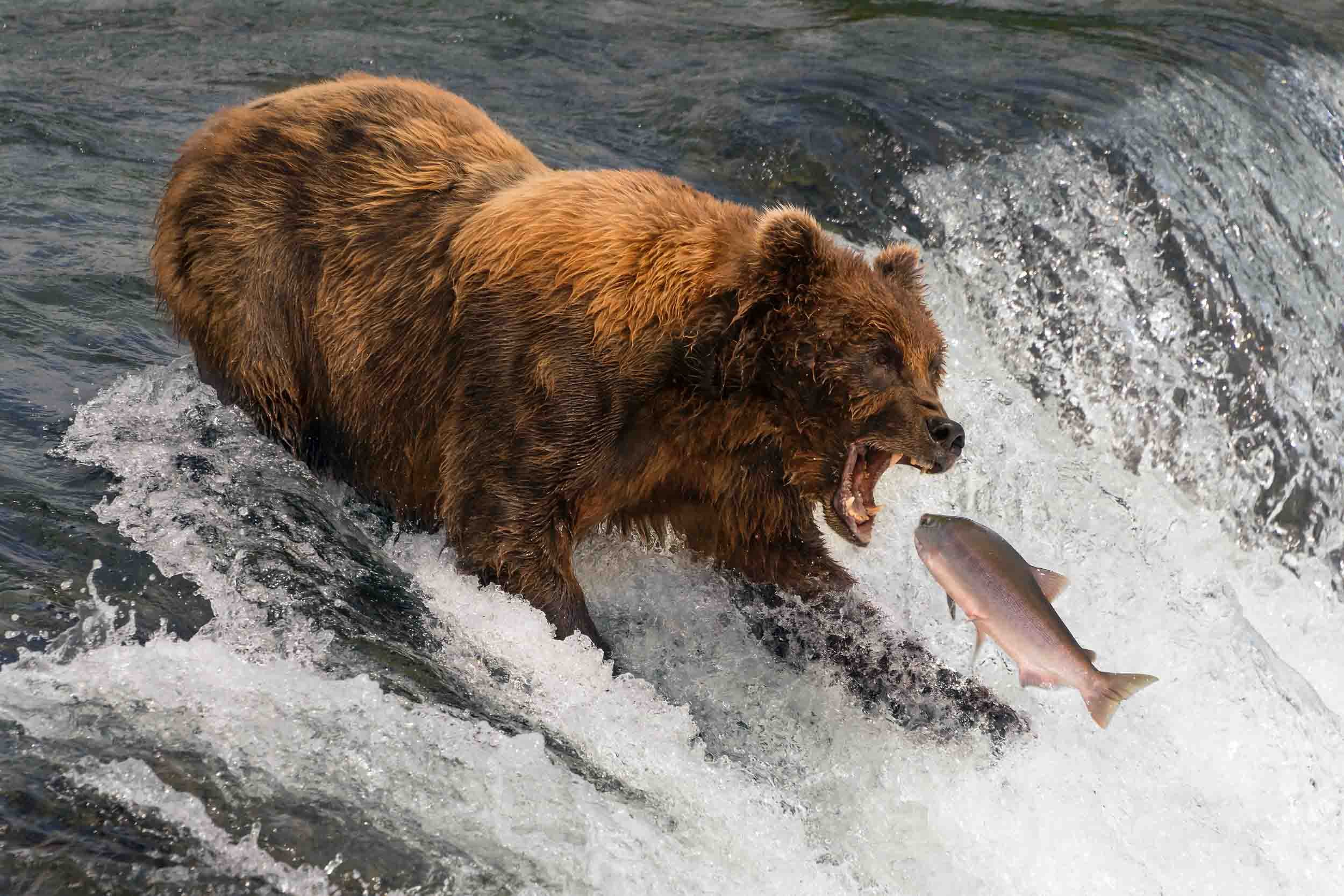
Point of view
I'm a wildlife photographer, and the most important rule of wildlife photography is to get down to eye-level with the animals.
It makes a huge difference to the composition and elevates a quick snap to an intimate portrait.
Taking pictures at eye level sometimes means getting wet or muddy - especially if you're taking pictures of insects on the ground! - but it's the best way to go.
The same applies to portraits, which usually look best taken at eye-level or above.
If you get down any lower than that, you take the risk of ending up with a close-up of the model's nostrils!

Motion blur
A photograph is just a static image, so it's sometimes difficult to convey a sense of motion.
One way to do that is to use a slower shutter speed in order to create motion blur.
Different subjects require different shutter speeds, depending on how fast they are moving, so you might need to experiment a little bit to find that sweet spot between too much sharpness and too little.
You could start with 1/4 of a second for a pedestrian walking along the street, but a Formula One car would disappear if you didn't cut that down to 1/250 or slower.
If you want to go the whole hog, you might try the 'slow pan'.
Panning just means moving the camera from side-to-side to keep a moving subject in the same part of the frame.
The 'slow' bit relates to the shutter speed.
What you get with a 'slow pan' should be a recognisable subject with relatively sharp eyes but blurred limbs (or wings) and a blurred background.
I warn you that this is a tricky business - I once took 1,500 slow pan pictures of guillemots in the Arctic and only kept four of them! - but it's worth it when it works...

Depth of field
Another crucial element in wildlife and other kinds of photography is depth of field.
To make sure the focus is on the subject and separate it from the background, you can use a larger aperture (such as f/4 or f/2.8).
That will blur anything that's not in the same plane as the subject while keeping the focal point sharp.
The eyes are always the most important part of a portrait - whether it's of an animal or a person - and we will always see something as being 'in focus' as long as they look sharp.
Depth of field is just as important in landscapes, but what we generally want now is sharpness all the way through the image, so it's better to start with a smaller aperture such as f/11 or f/16.

Odd numbers
One of the funny things about the way people see the world is that we seem to like odd-numbered groups of objects more than even-numbered ones.
It doesn't really matter why, I guess, but it's an important point to remember when planning something like a still-life shoot.
Just make sure you have three or five tomatoes rather than two or four!
Fill the frame
Everyone has a camera these days because everyone has a mobile phone, but one of the problems with using your mobile to take pictures is that it's hard to 'fill the frame'.
It's all very well taking a selfie when you're only a few inches from the lens, but trying to zoom in on a distant object or animal is difficult when you only have a few megapixels to play with.
It's important to remember here the difference between 'optical zoom' and 'digital zoom'.
The optical version is what you get naturally with a DSLR lens when you zoom in by changing the focal length; the digital version is when a phone or a bridge camera fools you into thinking you're zooming in by focusing on a smaller and smaller portion of the sensor.
It's great when you look through the viewfinder or look at the back of the camera, but the image quality is a lot poorer.
Anyway, the point is that what you really want to do is to make the subject dominate the image by making it as large as possible.
If you're taking a picture of a cheetah, you don't want it to be a dot in the corner of the frame!
You can always crop the image later using Lightroom or another editing program, but that means losing pixels, so the quality will suffer.
It's always better to get it right in camera if you can. You just need to be careful not to chop off body parts in the wrong place when you're taking a portrait.
Generally, it's fine to crop in on someone's face so that the top of the model's head is not shown, but it's not a good idea to crop people's bodies at the joints.
It just looks odd if the edge of the frame coincides with the ankles, knees, waist, elbows, wrists or neck.

Aspect ratio
For some reason, taking a picture in landscape format just seems more 'natural' than turning the camera 90 degrees for a portrait, but it's important to choose the 'right' aspect ratio for the image.
A photographer once advised me to make sure at least a third of my pictures were in portrait format, but the point is to look at the subject and decide what's best.
If there are a lot of horizontal lines, then landscape is fair enough, but if there are more vertical lines - such as tree trunks in a forest - then you should probably choose portrait instead.
If you really want to emphasise the length (or height) of a subject, why not try a panorama instead? Different cameras have different set-ups, but the average aspect ratio of a DSLR is 3:2, which doesn't suit all subjects.
I've set up a 3:1 template in Lightroom to use for images in which nothing much is happening at the bottom and top of the frame.

Foreground interest
When we see a beautiful view, most people's instant reaction is to take a picture, but what we end up with a lot of the time is an image without any focus.
Placing an object in the foreground can lead the eye into the frame and give the image balance.
A picture taken on the beach, for instance, might be improved by getting down low in front of a weird rock or piece of driftwood.
Balance
Speaking of balance, it can be a good idea to have the main subject on one side of the frame and a smaller subject on the other.
Again, it's just a matter of what looks most satisfying to the human eye.
Juxtaposition
Old and new, blue and orange, large and small - all these are contrasts that a photograph can pick up on and emphasise.
This kind of juxtaposition can be made the point of an image.
Think of an elephant beside a mouse - it's not a picture of an elephant or a picture of a mouse, it's a picture of the contrast between the two.
Patterns, textures and colours
Sometimes, you don't need a traditional 'subject' to make an image visually interesting.
There are plenty of patterns in Nature or in the man-made environment; the trick is to find them amongst all the surrounding clutter.
Whether it's the bark of a tree or paint peeling on a wall, you can sometimes get a very effective abstract image out of it.
Black and white images tend to emphasise patterns and shapes, as there is no colour to distract the eye, but colours can form patterns as well - it just depends on the subject and your personal preference.
Simplicity
It's hard to produce a visually striking image if there is no focal point, or if there are too many competing centres of attention.
By creating a simple image - in terms of colour and/or composition - you can remove the distractions and focus on what's important.
Clean backgrounds
To increase the focus on the subject of an image, it's a good idea to remove any distractions in the background.
It's obviously not a good idea to take a picture of someone with a telegraph pole sticking out of his head (!), but it's easy to pay too much attention to the subject and not enough to the background unless you consciously check the viewfinder.
One useful way to reduce the chances of an embarrassing blunder is to reduce the depth of field by increasing the size of the aperture.
The traditional way of taking portraits of animals or people, for instance, is to use a 'fast' lens, which means one that has a very wide maximum aperture, and shoot wide open.
That reduces the depth of field, thus blurring the background and adding to the impact of the main subject.
If you have lights in the background, you can even get a nice effect called 'bokeh', which works well for something like a bauble with Christmas tree lights in the background.

Humour
Whatever you're photographing, there are always odd moments of humour to be found.
People and animals are usually the best sources, but it doesn't really matter what the subject is.
If there's a visual joke to be made, why not have a go?
I laughed when I saw these penguins together on South Georgia.
It looked as if the female was confused by the rock. Was it an egg she was supposed to hatch, or was it just a rock?
She spent about five minutes looking at it and examining it before the male came up and said something like, "Come on, darling. It's just a rock..."

"Come on, darling, it's just a rock..."
Breaking the rules
Having said all that, it's important to break the rules once in a while. Rules tend to set expectations, so breaking them can make an image seem fresh and original.
Why should the horizon be straight? Why should we see the whole face rather than just half of it?
Why should the sky start two-thirds of the way up the frame?
If you can't answer these questions, then why not take a risk? It's a bit like being a painter: you have to be able to follow the rules before you can break them!
As Picasso once said, “Learn the rules like a pro, so you can break them like an artist.”
If you'd like to know more or want to book a photography lesson with me, then please get in touch.
Good luck...!